Writings
Designing Deizu from Zero to One
The comprehensive breakdown of designing Deizu from scratch.
The Issue
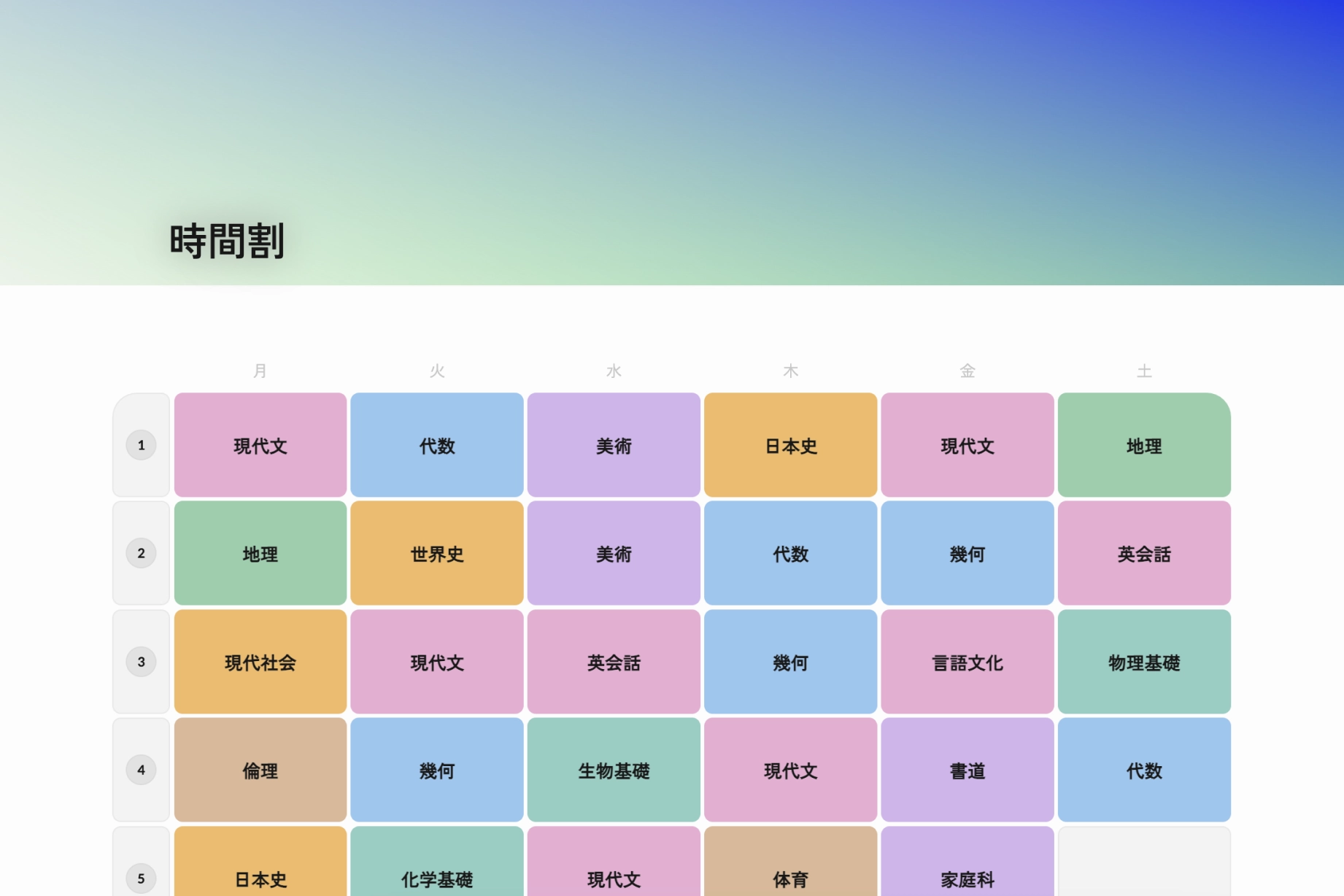
In Japan, timetables are a ubiquitous format when it comes to organizing schedules.
Because schools distribute schedules for the masses, timetable creation is often left to individuals. Everyone has their own way of creating and managing them.
- Using a spreadsheet application like Excel or Google Sheets. This is a common method but it takes time to make it look aesthetically acceptable.
- Using apps like Google or Apple Calendar. Using a calendar is a good alternative but it is not designed specifically for timetables. We are using a high fidelity tool to represent low fidelity data.
- Using paper and pen. The method most people resort to due to its simplicity. However, it is not easy to share or modify.
These alternatives work but they are not designed specifically for timetables. This is an interface problem. Timetables are a unique format that require a specialized interface to manage effectively.
Deizu is a project I have been working on since my junior year in high school that aimed to address these initial pain points by providing a user-friendly interface for creating timetables.
The Audience
I was a student when I started this project. I was the target audience. I wanted to create a tool that would make my life and others easier and more organized.
I value simplicity and ease of use. I wanted to create a tool that was easy to use and understand. I also wanted to create a tool that was visually appealing and enjoyable to use.
v0 - The Prototype
I started the project by creating a simple interface that allowed users to create and manage their timetables. I used HTML, CSS, and JavaScript (Web components) to build the initial prototype, and quickly deployed and shared it with my friends and classmates.
This initial version was very barebones. Users could access the site, insert subject names, and change the color of each cell. However, because it lacked any sort of authentication or data storage solution, users could only access their timetables on the device they created them on, and if they refreshed the page everything would reset.
Although very primitive, it was much more effective in communicating my ideas than what I had initially made which were static wireframes and sketches.
I found that building high fidelity prototypes and deploying them on working sites were far more effective in communicating my ideas than just showing them mockups. It was a great way to get instant feedback from my peers.
My classmates were very receptive to the idea and provided me with feedback. Some notes I got were:
- Users wanted to be able to come back and edit their timetables.
- The app should be able to handle multiple timetables.
- Users wanted to be able to share their timetables with others.
- Users wanted to add more information to each cell (e.g. location, teacher, etc.).
v1 - Pushing to Production
I took the feedback I received and started working on the next version of Deizu. Building on what I learned from the rough prototype, I decided to use this as another opportunity to learn a framework called React.js. I rebuilt it as a platform that could handle multiple timetables and allow users to share them with others.
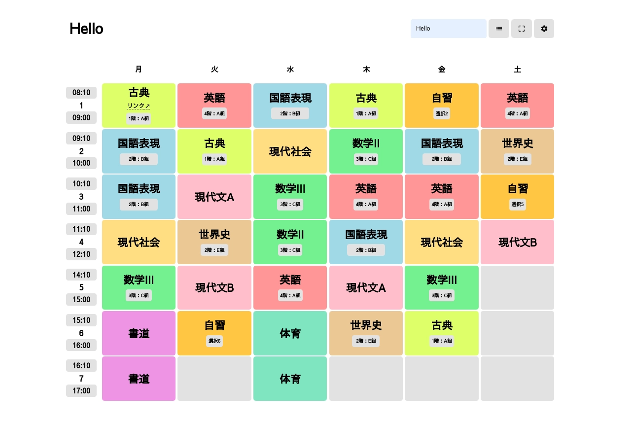
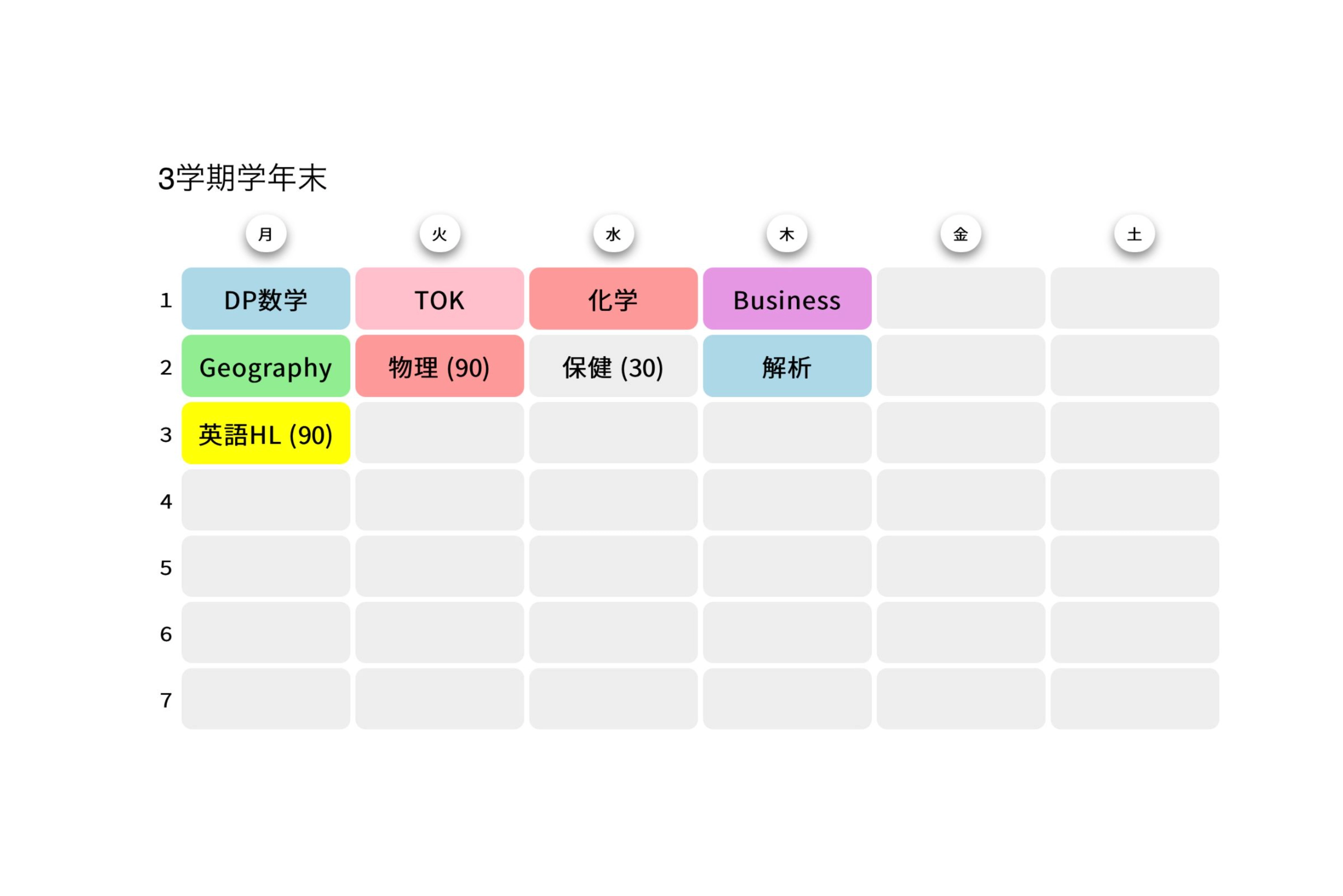
This new version allowed users to log in using Google, allowing them to quickly and easily create an account and save their timetables. This was also the first time I intended to build software for the public. With this, I added the ability for users to add start and end times to each row as schools typically have different start and end times. I also added the ability to add more information to each cell, such as location and teachers.
Aside from pure utility, customization options allowed users to change the theme color and corner radius of their timetables.
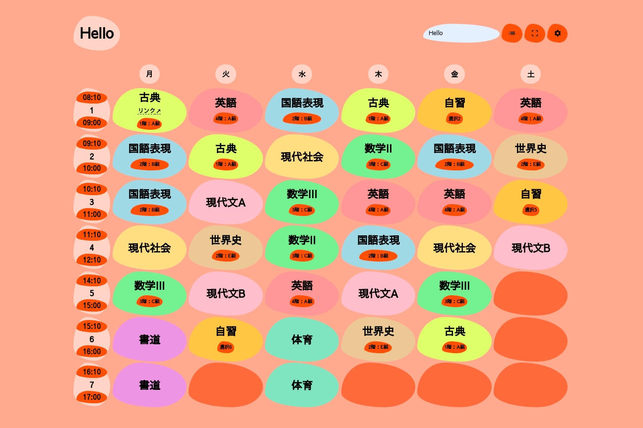
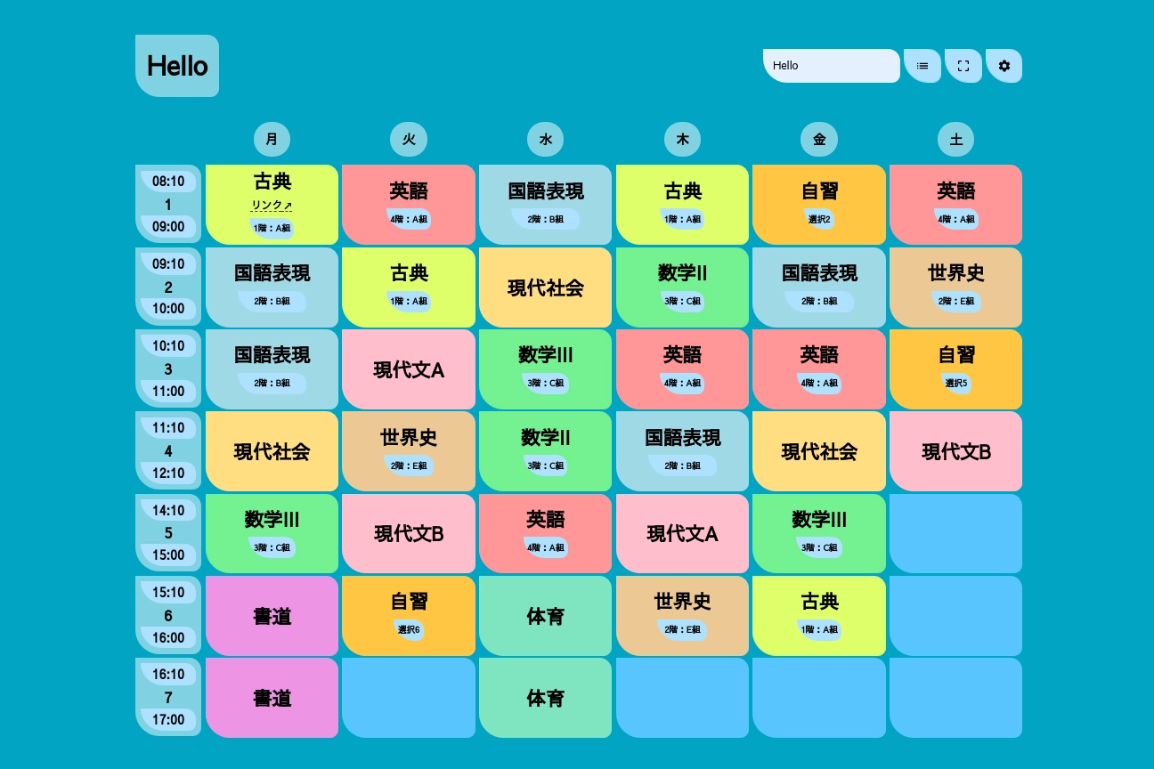
However, user adoption of these features was slow and I quickly realized that this probably wasn’t the best approach. The customizable corner radius would make the inner content overflow, which was not aesthetically appealing. The theme colors, although a fun way to make the timetables feel more personal, contrasted badly with the already colored cells.
How could I make the app more visually appealing without sacrificing usability?
v2 - Refining the Design
In v2 users could add wallpapers to their timetables. Users could copy an image URL from the internet and attach it as a banner image to their timetables, allowing for customization without cluttering the main grid interface.
This was also when I switched to using Next.js. I had been using React for a while and wanted to try out Next.js, a framework built on top of React that allows for server-side rendering and static site generation. This allowed me to improve the performance of the app and make it more SEO friendly.
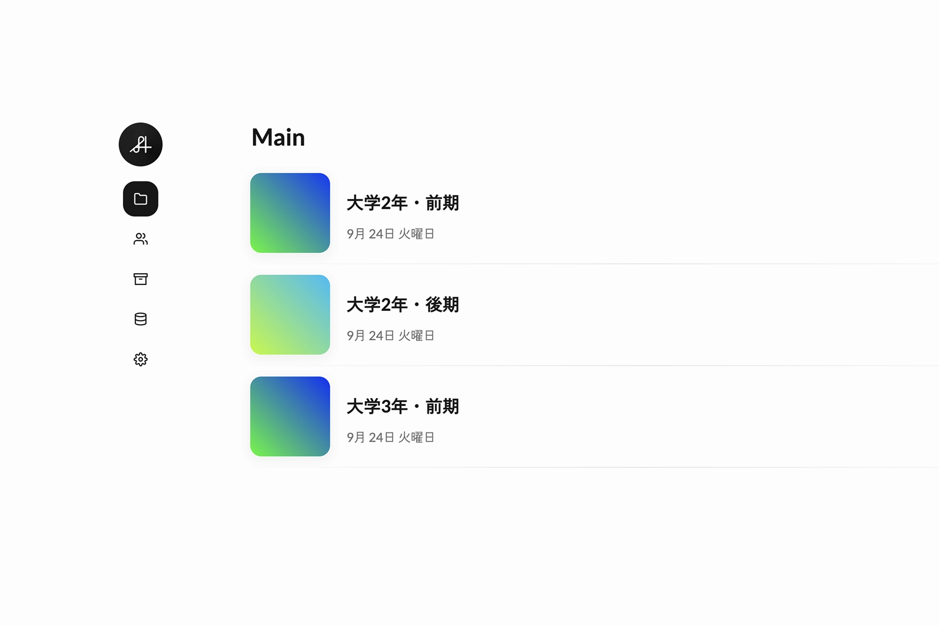
Datasheets
v2 was also the first version where I fundamentally rethought how the user experience for a timetable could be improved outside of this simple interface.
The previous version of Deizu improved the “editing” experience, so the next question I asked myself was “How could the data input experience be improved?” Especially when you had the same subjects across different days of the week or different timetables.
The answer was to separate the subject data from the timetable so subjects could be reused rather than created every time. This was the birth of the “Datasheet”.
Datasheets are a way to manage and share subjects. They allow you to create, edit, and delete subjects, as well as share them with others. This allowed people to quickly input subjects from a pre-existing list rather than manually typing every time.
v3 - Continuing to Iterate
Here is a demonstration of using datasheets in v3
Users would click and scroll through a list of subjects, and when they found the one they wanted, they would click on it and it would be added to the timetable. This was a much more efficient way to input data, and it also allowed users to quickly find and select the subjects they wanted.
Aside from datasheets, through analytics I found that over half of Deizu users were viewing the site from their phones, despite it being a web application. This made me rethink the design of the app. I wanted to create a design that was more visually appealing and easier to use on mobile devices.
This is also when I dropped the themes.
I decided to take a step back and focus on the design of the app. I started by creating a new design system with a fresh color palette, typography, and layout.
v4 - Stressing the Details
Deizu v4 is the current version of the app. It is a continuation of the design iteration process, with a focus on improving the details and making the app more visually appealing. Click here to learn more about it.